Propfolio
RobinHood for Real Estate
Quick Summary
Propfolio is a data visualization and portfolio management app for real estate investors, pitched to me originally as the "Robinhood of Real Estate."
Tech Stack
Figma, Next.js, Supabase


Inception
Sam and Luke are real estate agents in San Diego. Recognizing a gap in the market for a modern portfolio management solution, they approached Garrett for help developing their Figma designs into a polished MVP.
The designs showed a clear brand identity but left important questions about feature scope and scaleability unanswered. While at first glance, the file seemed quite comprehensive...

...further inspection revealed several ambiguities that would obstruct development.
Issues with Initial Design
1. Components without clear purpose or meaning
The house-shaped icons in the screenshot below do not have explicit meaning. While the blue icons labeled "vacant" imply the other two styles (green checkmark and red 'x') have something to do with occupancy, but it's unclear. Furthermore, making the 'vacant' icons blue implies vacancy is a "neutral" status relative to green's "positive" and red's "negative." From here, you might infer "green" signifies "occupied." But if green means "occupied," and blue means "vacant," what does that make red? What's worse than vacant? Condemned? When asked, Sam and Luke were unsure.

2. Designs did not account for how data actually gets into the app
The designs assumed a preexisting connection to some database, but they did not account for any empty state. How, then, does the app know what data to show? If each user has a unique portfolio of their own properties, how does the app know what those properties are? Does the user input them through the app? How? Is it one at a time, or can they bulk import a CSV? What does the app look like when the user first logs in and has no properties?

The file was full of omissions like these which, to play devil's advocate, are understandable when you're still in the brainstorming phase. But now that we'd decided to proceed, we needed to address them.
Identifying Remaining Work
Having identified ambiguities in the design files, the next challenge was creating a concretized list of acceptance criteria and user stories. These would serve as the basis for the development roadmap and provide a concrete, yet flexible-if-need-be, framework for task management, progress-tracking, and quality control.
I created our acceptance criteria using my evergreen MVP checklist, which you can read in full here.
Development
Environment Setup
Using a simple Supabase + Next.js stack, I constructed the front end using a proprietary framework called LiftKit, which uses React's Context API to manage the theme globally. View Full Documentation.
LiftKit combines a unique, golden-ratio-based scaling and spacing system with Material 3's powerful dynamic color engine, as well as a hybrid typography system built from combining Material's 15-class system with HIG's.
Both the scaling system and color scheme can be configured by global variables of varying specificity. See the demos below.
Static UI
I used this project as an opportunity to flesh out LiftKit's essential UI components, which had already been designed visually in the Figma and Webflow kits. Mapping those components into simple JSX proved no issue.
The complex components were easy to spin up as well, because LiftKit is designed to facilitate ad-hoc component organization.
The idea is this: no component library will ever have everything you could possibly need. Countless WYSIWYG editors have tried it, and all have failed. Sooner or later, you just have to make custom UI components to remain scaleable.
That's where LiftKit differs from other frameworks. Instead of prescribing a large set of prefab components, it gives rules for making custom ones quickly. The visual patterns which define a system's brand identity (i.e. spacing, color, type, scale, and motion) can be easily enforced by baking them into utility classes via global variables and calc() functions. Then, by using Tailwind-like naming conventions, we abstract the math away and give devs clean utility classes to work with. That way, if a developer recognizes the opportunity for a simpler UI solution that will solve dev constraints, they can quickly and easily mock up a solution that auto-adheres to brand guidelines, streamlining the mid-development pivot flow, and making it easier to collaborate with the design team for approval. Less friction, happier teams, better products.
Catching Scalability Problems
A common hurdle when translating from Figma to dev is dealing with mid-development realizations that the designs are unscaleable. This is the unavoidable consequence of designers not having to think about two fundamental development constraints:
- Where data comes from
- How states and props get passed.
While Figma did add prototyping features that mimic state management in 2023, it failed to bridge the knowledge gap. There are a few key reasons for this:
- The feature can simulate passing props down, but not lifting state upsome text
- Therefore, user input behavior can’t accurately be modeled in the prototypes
- The prototyping behavior isn’t auto-documented.some text
- Dev mode doesn’t reveal how any of these behaviors work, leaving it up to the designer to diagram it. Since that’s a time-consuming process, most simply don’t.
- It’s a steep learning curve for juniors, making it hard to adapt to larger product teams’ workflows.
As a result of these shortcomings, Figma designs always start from a static set of premises, whether it be a static set of data, a fixed viewport width (vw does not exist in Figma), or any other assumed facts about the user in a given scenario. It’s then the developers job to “read between the lines” and keep an eye out for design choices that could limit future growth of the app.
Let’s take a look at an example from Propfolio, where this very problem emerged.
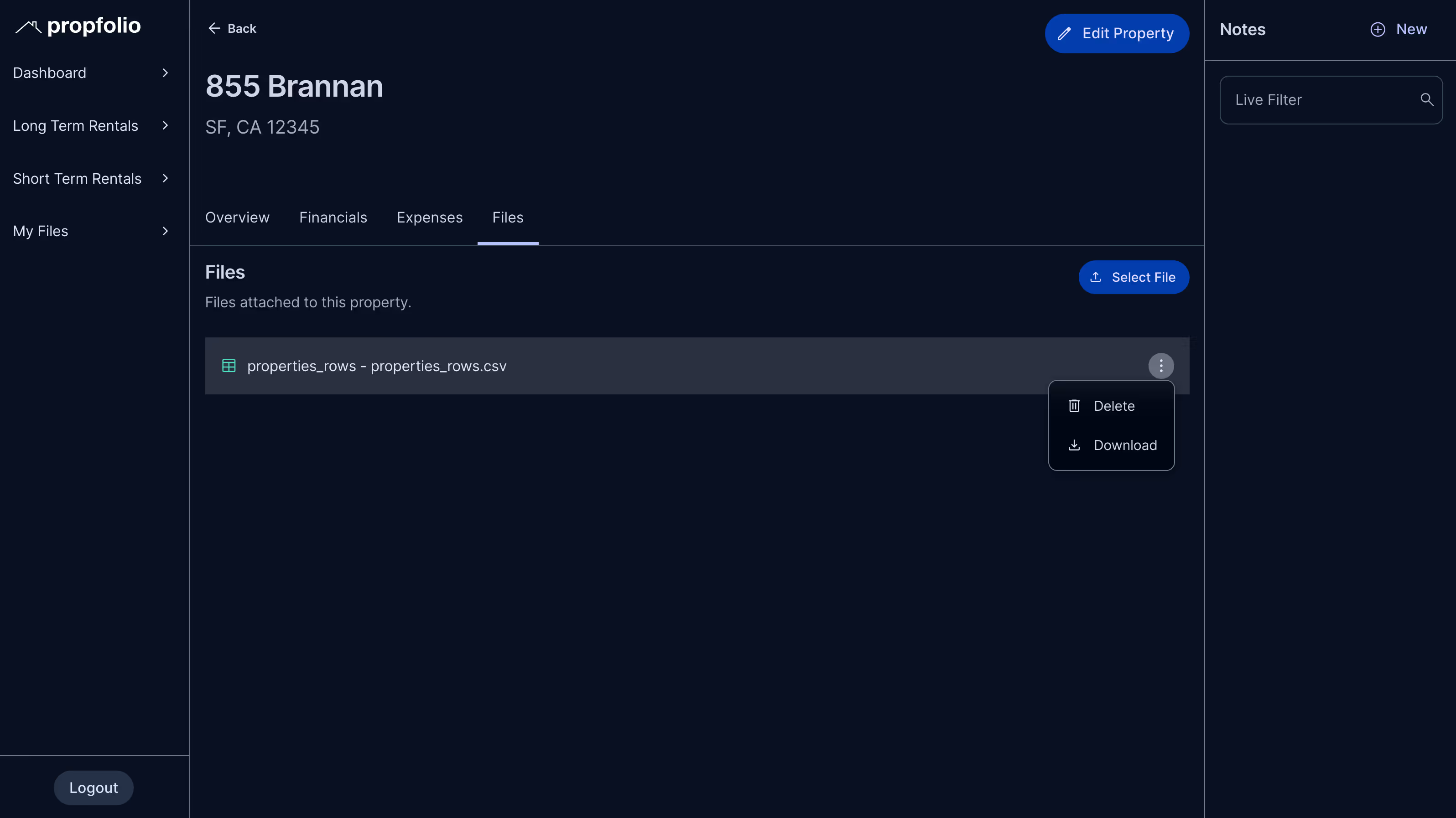
Example: The “Files” Panel
Take a look at the key screens below: “Dashboard” and “Property Profile.”

These designs share essentially the same layout, except Property Profile has an added “Attach Files” module in the bottom of the right sidebar:

On its face, it’s perfectly simple. In Figma, all you have to do is assign the files container a boolean prop you can toggle on or off. No problem. And in development, that’s exactly what I did.

/*
 * this is a stripped down sample for explanatory purposes,
 * which assumes all non-primitive types used in the interface declaration
 * are imported previously.
 *
*/

interface SidebarProps {
  user: UserAttributes;
  notes: Note[];
  files?: Files[]; //optional, since we might not even be showing it
  showFilesPanel?: boolean;
}

export default function Sidebar({user, notes, files, showFilesPanel}: SidebarProps) {
  return <>
    <NotesPanel user={user} notes={notes}/>
    {showFilesPanel && <FilesPanel user={user} files={files}/>}
  </>
}
Hang on, though. This is passing down files as props from a parent component, meaning we’ll still be loading the files even if we don’t intend to show them. That’s a big problem for performance, especially since the screen where files won’t appear is the Dashboard. The Dashboard screen displays aggregated data from every property, so we’d be loading every single file the user’s ever uploaded, and we wouldn’t even be displaying them.
It’s a simple fix; we just refactor to only load the files if showFilesPanel is true.
But wait, now we’ve got another problem.
Alright, then, so we need to refactor. We’ll only load the files data if showFilesPanel is true.
But wait, there’s another problem.
Example 2: “Oops, we didn’t think of that.”
Design forgot to account for the fact that there’s nowhere for the users to look at all their files at once. They can only view files by going to a single property. If a user forgot which property they attached the file to, then they’re out of luck.
Furthermore, what if they have a file that doesn’t pertain to just one specific property? Do they just assign it to one at random? That’s not helpful.
Again, the solution seemed simple. They should have a “My Files” tab where they can manage all their files in one place, whether attached to a property or not! However, this too led to an exponential cascade of follow-up questions:
- How should it visually distinguish between attached and “free-floating” files?
- Can you attach a free-floating file to a property after uploading it?
- Can you move files from one property to another?
- Can you rename a file?
- Can two files have the same name if they’re linked to different properties?
- What if I upload a file from the Files tab, is it a different flow than uploading one from the Files panel on a Property Profile?
Great. Now, we’ve got to go back to Design and get clarification before we can proceed.
Giving Teams the Right Tools to Communicate
This is an unavoidable part of the product development process, but when designers and engineers share a similar mental model, you can get through these hiccups much faster. With a system like LiftKit, the UX Engineer can simply mock up their alternative and bring it back to the team for approval.
Without it, the engineer would have to go back to design, describe the problem as best they can, wait for a redesign, and go back and forth until the fix is sufficient.
In the above scenario, efficiency relies on the two parties’ written and verbal communication skills. But as anyone who’s watched an introverted developer try to explain states and props to an extroverted designer in the span of a 30-minute Slack huddle can tell you, it’s not the most efficient way to do things.
My experience has been that the average dev would much rather simply mock up the thing they’re trying to describe and show you the thing than try to put it into words. I’ve also learned that this is the quickest way for projects to get back on track.
Maintaining momentum. That’s the key. And there’s no better way to do that than to give both sides of the team the power to create.
Adding Motion
We used the increasingly-popular React Motion library by Framer to smooth out major transitions. Check out these artifacts from development.
<AnimatePresence> with Live-Filtering Lists
Tabs, Modals, and Recharts Graphs
More
Websites

Amalfi Jets
Redesigning the fastest-growing name in private jet travel.
Amalfi Jets
Redesigning the fastest-growing name in private jet travel.
Amalfi Jets
Redesigning the fastest-growing name in private jet travel.

GEM Theatre
Constructing an art deco masterpiece for a longstanding cultural landmark.
GEM Theatre
Constructing an art deco masterpiece for a longstanding cultural landmark.
GEM Theatre
Constructing an art deco masterpiece for a longstanding cultural landmark.

Origin Point
Migrating massive, cinema-scale videos into a dynamic library with rich animations.
Origin Point
Migrating massive, cinema-scale videos into a dynamic library with rich animations.
Origin Point
Migrating massive, cinema-scale videos into a dynamic library with rich animations.

Pulling Paint Murals
A brutalist reimagining of a brilliant LA mural shop
Pulling Paint Murals
A brutalist reimagining of a brilliant LA mural shop
Pulling Paint Murals
A brutalist reimagining of a brilliant LA mural shop

Strong For Life
Design Rush's Best Health & Wellness Website of 2024
Strong For Life
Design Rush's Best Health & Wellness Website of 2024
Strong For Life
Design Rush's Best Health & Wellness Website of 2024
More
Apps

LaborPost
Department of Labor Compliance App
LaborPost
Department of Labor Compliance App
LaborPost
Department of Labor Compliance App
.avif)
Propfolio
RobinHood for Real Estate
Propfolio
RobinHood for Real Estate
Propfolio
RobinHood for Real Estate

Chainlift Color
Material Theme Builder plugin for Webflow
Chainlift Color
Material Theme Builder plugin for Webflow
Chainlift Color
Material Theme Builder plugin for Webflow

Project Equity
A Rich Text Database with Track Changes & Version Control
Project Equity
A Rich Text Database with Track Changes & Version Control
Project Equity
A Rich Text Database with Track Changes & Version Control

TicketFair
An interactive quote-builder for web developers.
TicketFair
An interactive quote-builder for web developers.
TicketFair
An interactive quote-builder for web developers.
More
Videos

Secret Science of Perfect Spacing
Design theory tutorial describing LiftKit's spacing theory.
Secret Science of Perfect Spacing
Design theory tutorial describing LiftKit's spacing theory.
Secret Science of Perfect Spacing
Design theory tutorial describing LiftKit's spacing theory.

How to Use Color Correctly
Colors mean things. Here's why.
How to Use Color Correctly
Colors mean things. Here's why.
How to Use Color Correctly
Colors mean things. Here's why.

Perfect Ratios and How to Find Them
Part Two of my Spacing Series
Perfect Ratios and How to Find Them
Part Two of my Spacing Series
Perfect Ratios and How to Find Them
Part Two of my Spacing Series

Building A Clean, Modern Resume Site with LiftKit
A quick tutorial about how to create a modern personal website using LiftKit.
Building A Clean, Modern Resume Site with LiftKit
A quick tutorial about how to create a modern personal website using LiftKit.
Building A Clean, Modern Resume Site with LiftKit
A quick tutorial about how to create a modern personal website using LiftKit.
More
Frameworks

LiftKit
A Design System for Clean, Organized Layouts
LiftKit
A Design System for Clean, Organized Layouts
LiftKit
A Design System for Clean, Organized Layouts

LiftKit for Figma
The golden framework makes its way to Figma.
LiftKit for Figma
The golden framework makes its way to Figma.
LiftKit for Figma
The golden framework makes its way to Figma.

The MVP Checklist
An evergreen cheat sheet for identifying the scope of a project.
The MVP Checklist
An evergreen cheat sheet for identifying the scope of a project.
The MVP Checklist
An evergreen cheat sheet for identifying the scope of a project.
Quick Summary
Propfolio is a data visualization and portfolio management app for real estate investors, pitched to me originally as the "Robinhood of Real Estate."
Tech Stack
Figma, Next.js, Supabase